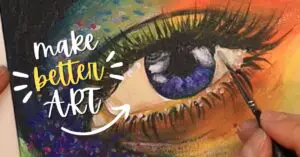
The definitive guide on avoiding muddy colors and getting consistently vibrant color mixes with acrylic paint.
Pin it for later! ⤵
After I finished my *ahem* scathing review of Arteza acrylic paints, I found myself tackling yet another question in the realm of colors – color mixing. More specifically, mixing colors that turn into mud…NOT on purpose.
Several attempts later, I came up with some interesting insights on the concept of creating muddy colors and how to avoid the dreaded thing in your artwork, all thanks to the color wheel.
I know what you’re thinking…
How is the color wheel supposed to help me avoid muddy colors? In more ways than one to be exact!
The color wheel tells us how to mix paint, what types of colors go well together AND can help us determine one crucial attribute – color bias!

and we are going to walk through what exactly this is! Check out the details in the video below or keep on reading this post.
*Links used below are affiliate links, which means I will get a small commission if you use these links, at no extra cost to you. If you want to support me and my blog, use these provided links 🙂 Your love and support is always appreciated.
Color Bias in Primary Colors
I am sure you are familiar with the primary colors: red, blue, and yellow. Those are the three colors that cannot be made by other colors AND can make all the other colors on the wheel itself.
In theory, if you were to mix blue with red on the wheel, you would get a lovely violet or purple. In the real world, this concept gets a tad complicated.
For example, when you use red or blue acrylic paint, you are actually using a certain shade of red or blue that is slightly biased towards another color.
See, when we deal with acrylic paint pigments, it is impossible to get a PURE primary color. There is no such thing as a pure primary paint pigment (hah! I love alliterations!).
In fact, paint colors tend to have a bias towards other colors on the wheel. For example, the color yellow has many paint manifestations that all bias towards other colors like lemon yellow (leans more towards the greens) or yellow ochre (leans more towards the oranges).
This is where it gets interesting.
Choose Colors That Lean Towards the Same Side of the Wheel
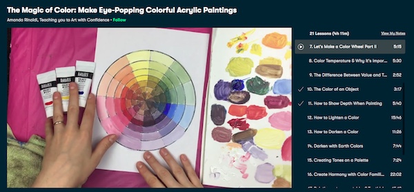
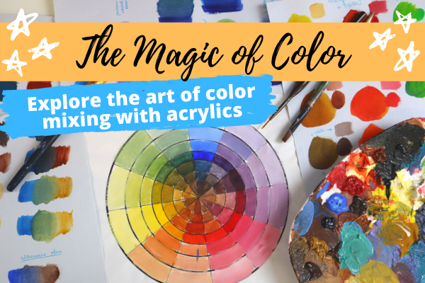
This is a core concept I teach in my Magic of Color class (which you can try for free on SkillShare for 1 month by clicking this link)- which covers where you choose your colors.
Like we mentioned before, if there is no such thing as a pure primary pigment, and all paint colors have a certain color bias, how would I know which ones are good for me to use?
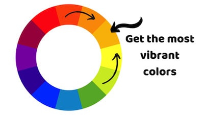
The easiest trick is to grab colors that lean towards the same side of the wheel.
For example, let’s say you want to make the color violet.
Based on its location on the wheel, I would want to grab a red that is leaning towards the violets (like crimson red), and a blue that is leaning towards the violets (like ultramarine blue). When those come together, they form a brilliant, deep purple that would make the rock band jealous.
OK that is good to know, but…where do muddy colors play into this?
Muddy Colors Happen with Colors Leaning Away from One Another
So here is where muddy colors come in.
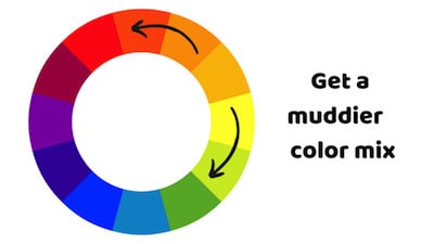
If you choose two colors that lean away from the goal color, that mixed color will appear a lot more muddy.
So going back to the violet mixing example, if I chose a red that was leaning towards the oranges (scarlet red) and chose a blue that was leaning towards the green (cerulean blue), I would end up with a muddier, darker looking violet. The colors are not vibrant and become very muted.
huh…interesting. Why does that even happen?
Mixing 3 Primary Colors Creates Browns and Black Colors
Do you remember the primary colors – red, blue and yellow?
If you were to combine all three of those primary colors – you will get various mixes that tend towards the browns and grays. And mixing equal parts of all three colors will produce colors that are close to dark brown and black.
What does this all mean for color mixing?
Adding colors together that contain all 3 primaries will be more likely to produce muddier mixes.
Going back to our muddy violet mix example once more, we combined scarlet red and cerulean blue; if you were to analyze these colors against the color wheel, scarlet red is pulling a bit more to the orange side of the wheel; cerulean blue is puling more to the green side of the wheel.
When you mix scarlet red with a bit of yellow, you get an orange color tone; when you mix blue with a bit of yellow, you get a greenish tone. Each of those colors were biased towards colors leaning away from one another – thereby introducing the color yellow. And like we just concluded, when you introduce 3 primaries together, a muddy color combination is created.
And to add more visual examples, violet’s complementary color is yellow – which means adding them together creates muted tones. *mind blown*
This same concept applies to all the other color mixes in the wheel.
If you are trying to create a certain color, be aware of where that colors lies on the wheel, and choose colors that bias towards that goal color, and avoid any color bias that tends towards that color’s complementary.
So, if I want to make a vibrant green, I would choose cerulean blue (green bias) and lemon yellow (green bias). If I wanted a muddier green, I would want to mix colors that have a red bias (since red is green’s complementary).
I know the world of colors and color mixing is cray-cray but super exciting – because you can now unlock so much potential in your acrylic paintings and actually make art that turns heads and souls sing with inspiration. I dive more into the awesome world of color, color-mixing, and attention grabbing art tactics in my SkillShare class, The Magic of Color, which you can try free for 1 month using my special teacher’s link here.
Try this Class Free for 1 Month ⤵
So, if you want to take your art up a notch and literally explode it with color (without spending a bajillion dollars on paint tubes), consider trying this class out.
Best Paint Colors to Use for Mixing
Now that you know all about color bias and how to avoid accidental muddy mixes, where can you go from here?
Knowing the color wheel enables you to make smart choices with your paint selection AND not break your budget buying 15 different types of yellows or reds. You don’t need to buy all the colors of the rainbow. You just need a limited amount of paint colors to make a large array of color mixes.
With that being said, I recommend you start with 6 versions of the primary colors – red, yellow, and blue, each of which have their own color bias (red-orange, red violet, yellow green, yellow orange, blue violet, blue green). This way you have everything you need to make a wide variety of brilliant and muted colors.
One of my personal favorite brands, Liquitex, has a great professional set of 12 colors you can use here. Of course, if you’re just starting out and working with a tighter budget, Arteza’s premium acrylic paint sets can work just as well.
And just so you have it, here is my list of recommended primary colors:
- Scarlet Red/ Naphthol Red Light (Red Orange)
- Crimson Red/ Quinacridone Crimson (Red Violet)
- Lemon Yellow/ Yellow Medium Azo / Yellow Hansa (Yellow Green)
- Yellow Ochre/ Yellow Oxide/ Yellow Orange Azo (Yellow Orange)
- Ultramarine Blue (Blue Violet)
- Cerulean Blue (Blue Green)
If you have all six colors, you can mix the entire rainbow very easily to make both vibrant and toned down, muted mixes. It’s really up to you and your color choices. No need for any extras.
Concluding Thoughts on Avoiding Muddy Colors in your Art
When it comes to your acrylic art, color is super important in telling your story; and to avoid your colors taking an unexpected dive into poop brown-ville, think about what colors you already have and where they bias on the color wheel. Knowing why and how your colors play together can save you plenty of headaches (and heartaches) down the line – giving your inspiration a much-needed boost and your canvas a gorgeous, head-snapping coat of colors.
And if you want to really master your color-mixing and create stunningly colorful artwork (without spending hundreds on paint tubes), consider taking my class The Magic of Color free for 1 month by clicking this link.
Try this Class Free for 1 Month ⤵
Related Acrylic Color Mixing Posts
How to Blend Acrylics Like a Pro